Automatic KPI selection
Identify useful totals, rates, trends, and comparisons from the available fields.
Convert an existing Excel workbook or CSV export into a decision-ready dashboard without manually choosing every chart or rebuilding the same KPI layout. ExcelDashboard AI analyzes the fields, identifies useful comparisons, and creates an editable starting point you can refine through conversation.
Turn Excel or CSV data into an interactive AI dashboard with KPI cards, charts, filters, and written insights—without manual dashboard setup.
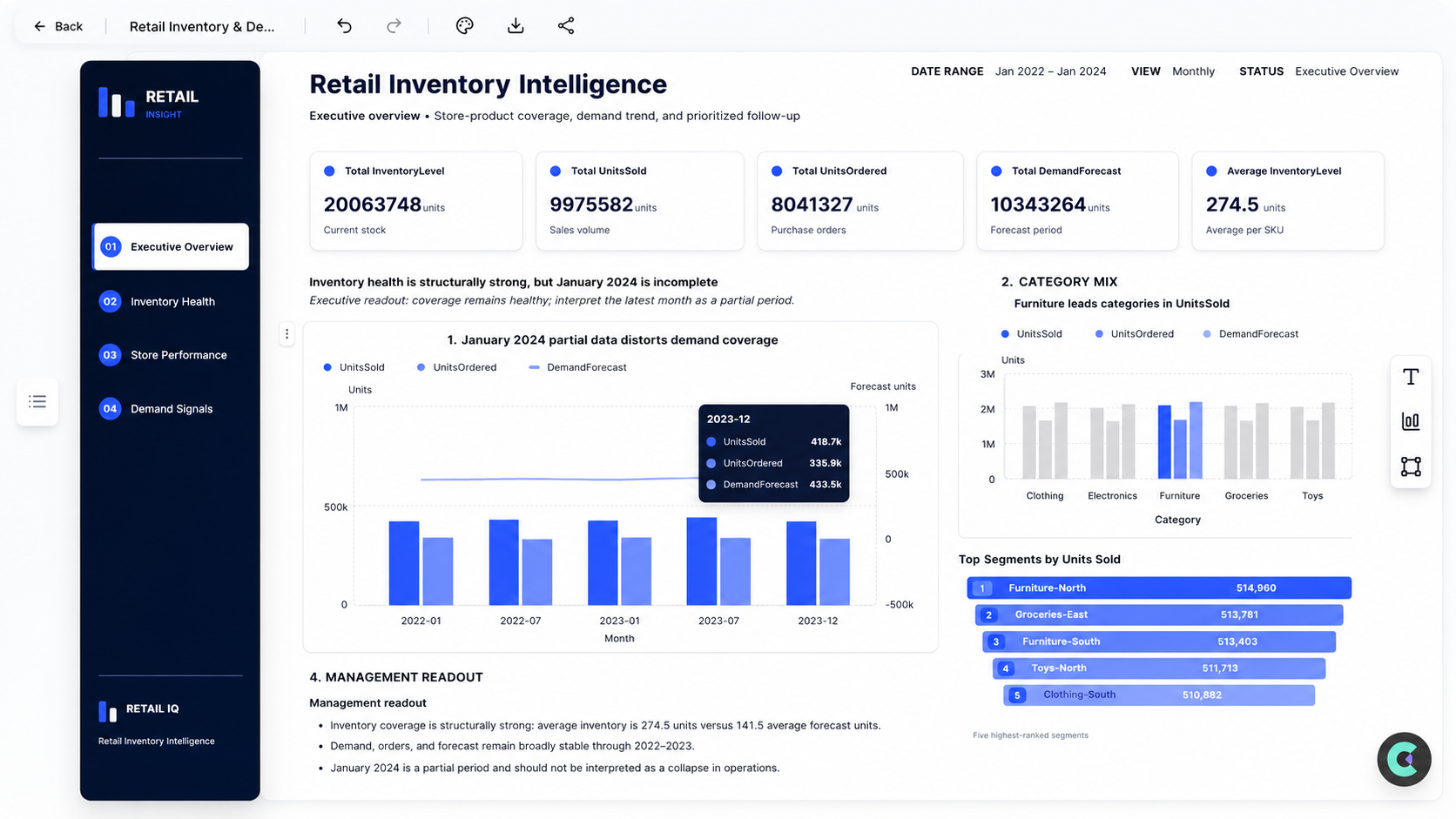
A useful dashboard needs more than a collection of charts. It needs a clear KPI hierarchy, sensible comparisons, and enough context for a reader to understand what changed. The AI dashboard generator reviews your columns and builds a structured first draft around the questions your data can answer. You remain in control after generation. Ask for a different breakdown, replace a visual, focus on a segment, or turn an unexpected movement into a deeper analysis. Keep the dashboard for monitoring, or continue into a polished report and editable PowerPoint for a stakeholder review.
Move from raw input to polished output in a guided, repeatable workflow.
Upload an Excel workbook or CSV export with clear column headers.
Tell the AI what the audience needs to monitor, compare, or investigate.
Inspect the generated dashboard and request different charts, filters, or emphasis.
Built to speed up analysis, creation, and delivery without extra manual work.
Identify useful totals, rates, trends, and comparisons from the available fields.
Match time series, rankings, distributions, and relationships with suitable visual forms.
Change the focus or level of detail with follow-up instructions instead of rebuilding the dashboard.
Add concise explanations that help stakeholders understand the most important movements.
Common scenarios where teams use this feature to save time and improve output quality.
Summarize revenue, margin, growth, and operational performance for leadership.
Compare regions, representatives, products, pipeline stages, and period-over-period results.
Bring channel spend, leads, conversions, and campaign outcomes into one reviewable view.
Answers to the questions users ask before they start.
It is a tool that uses your data and instructions to propose KPI cards, charts, comparisons, and a dashboard structure automatically.
Yes. Upload an Excel or CSV file and describe the audience or business questions the dashboard should address.
Yes. The first result is a working draft. You can ask follow-up questions and refine the analysis and presentation.
No. The workflow is designed around plain-language requests, while still letting experienced analysts inspect and refine the result.
Yes. After reviewing the dashboard, you can continue the same analysis into a structured business report and export an editable presentation.
Pair this feature with adjacent tools to cover more of your reporting and presentation workflow.
Create AI data presentations and executive-ready reports from Excel, CSV, text, images, or web research with charts, insights, and editable PowerPoint, Word, and Excel exports.
View featureChat with Excel and CSV data using AI. Ask questions in plain English and get metrics, tables, charts, explanations, and follow-up analysis without SQL.
View featureClean messy Excel and CSV data with AI. Remove duplicates, standardize formats, fix missing values, and prepare datasets for analysis faster with ExcelDashboard AI.
View featureStart with a free workspace and see how quickly you can turn inputs into polished outputs.